Broadside //
FPS-Z
Multiplayer
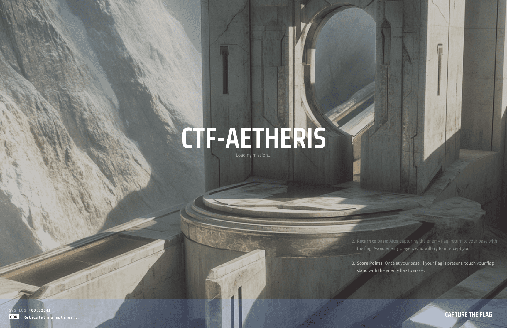
Futuristic Greek
I worked on the early-stage user interface designs for Broadside, creating in-game screens such as general menus, setting screens, and other key interface elements. The focus was on iterating on layouts, refining navigation, and improving overall user experience.
Role
Defining UI
What is a game interface? When it comes to the fundamental elements of multiplayer UI design, both designers and users would definitely highlight:
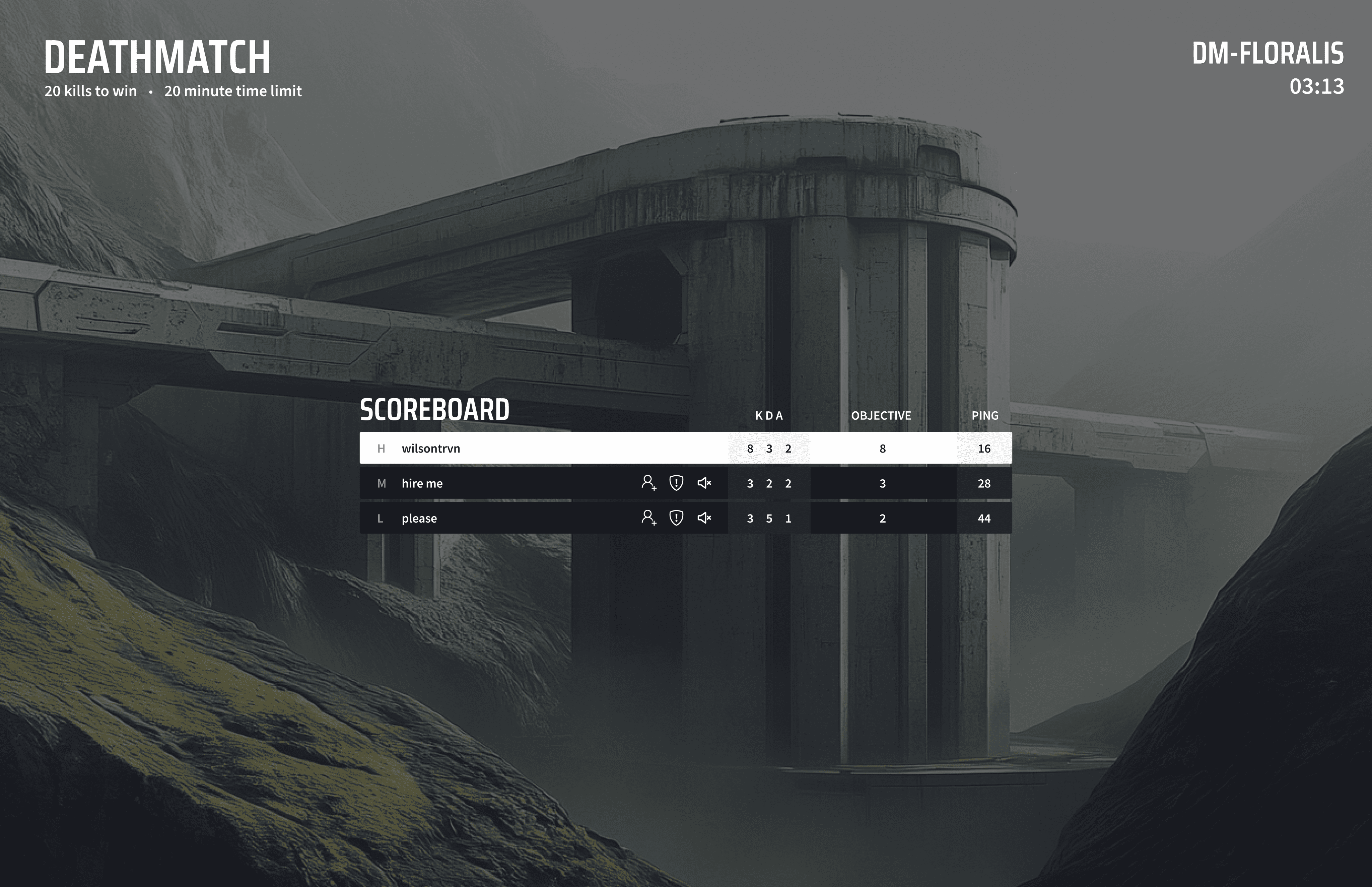
- HUD (Heads-Up Display) - Displays health, ammo count, energy, kill feed, mini-map, scoreboards, and other in game stats
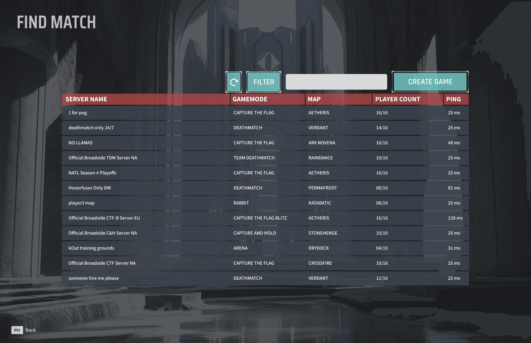
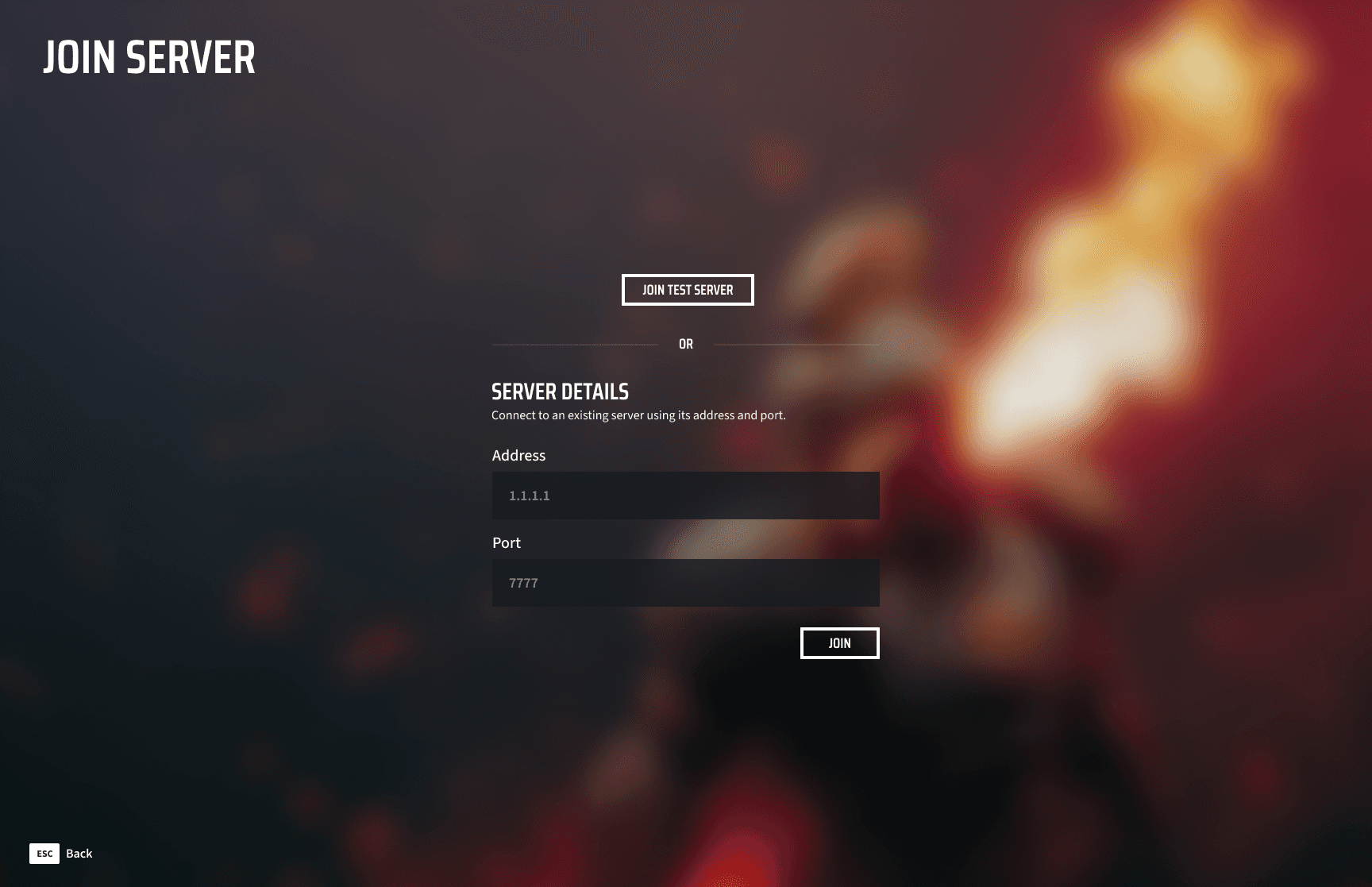
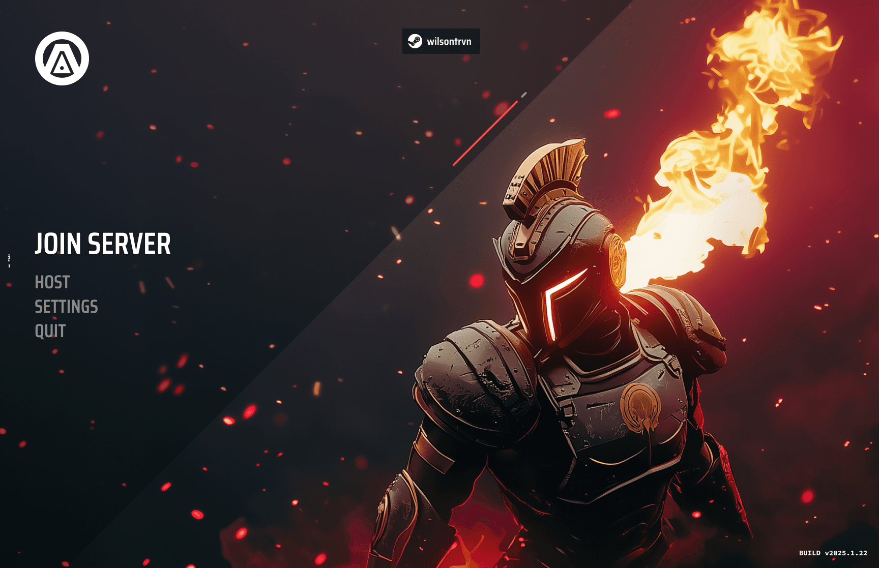
-Main Menu & Lobby System - Provides access to game modes, loadouts, social features and matchmaking
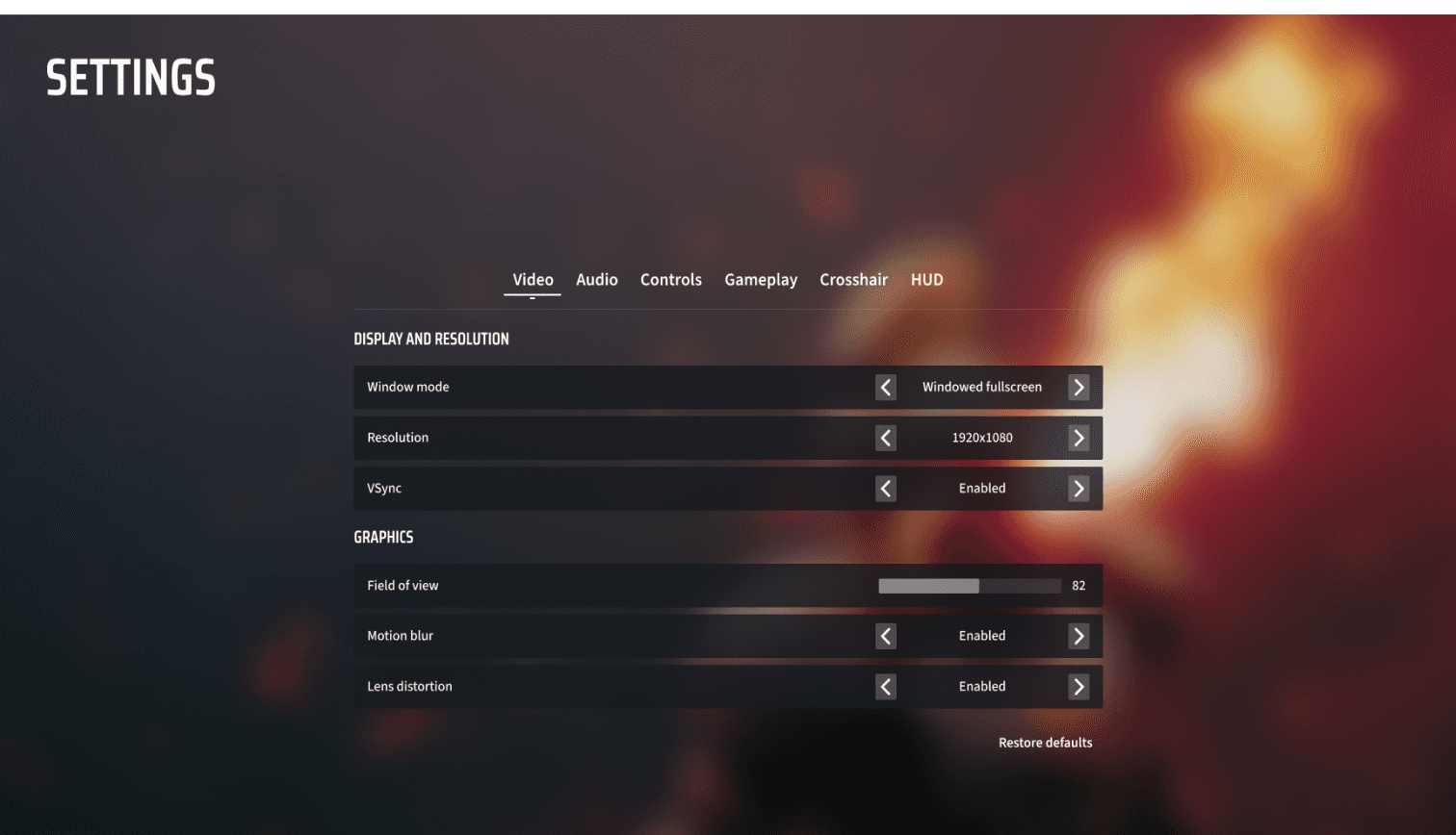
-Settings - Allow players to customize graphics quality, audio levels, key bindings, and other game play preferences
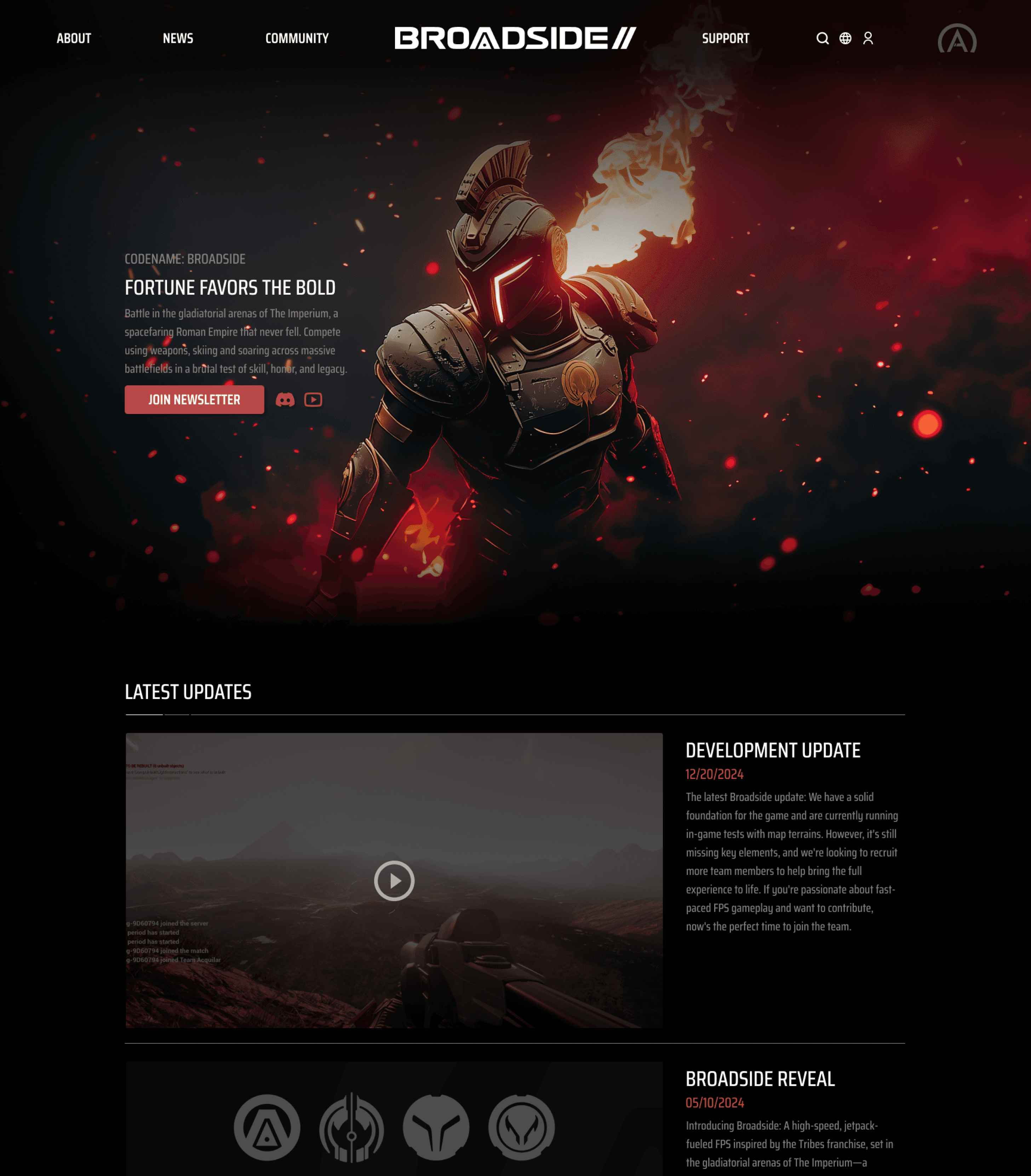
Broadside is an in-development multiplayer FPS set in the gladiatorial arenas of a spacefaring Roman Empire. The game aims to offer fast-paced, skill-based combat in large-scale battles, with an emphasis on competitive multiplayer action.
UI Designer
Summary
Experience Audit


Generic Prototypes
Exploring generic prototypes to test layout, functionality, and visual direction before full implementation.
Landing
I also worked on the landing page for the website before finding another member to fill that position. (The website is now hosted on an existing member’s Wordpress and my web design is no longer current 3/25/2025)


In-Game HUD
Sub-Menu
Conclusion
I had a lot of fun experimenting in this new industry of UI’s doing many tasks that I wasn’t familiar with. Transitioning from web and mobile app design to gaming UI was a challenge, as I had to gather references, analyze them, and determine what was both visually appealing and functional. If these prototype layouts are still in the game by the official release date, I would love the opportunity to do some extensive user research and fix potential issues.
Due to an NDA, this is all I am able to share and discuss publicly. However, I thoroughly enjoyed working on various aspects of the game and am grateful for the opportunity to contribute.
User Research
We conducted a small survey of 50 users within our community Discord/Reddit asking what users liked and disliked about each layout.
For the in-game HUD, a majority of users enjoyed the 3D immersive feel but wanted to take some elements from the 2D HUD such as the health/energy bars and compass.. Users heavily enjoyed the sleek minimalistic flat menu for multiple reasons.
a. Easy to navigate
b. Less animations to load
c. Directs attention towards art
After looking through all the user feedback, I made a couple of tweaks to the in-game HUD and kept the flat menu concept.

While this game is still in very pre-alpha development, these screens may evolve significantly as we continue refining the design, with plenty of time for adjustments to the layout and overall aesthetic before official launch.
Design Question
For a futuristic shooter game, would users opt for a more sci-fi immersive 3D HUD? Or will they prefer a flat minimalistic 2D? The same question also applied to basic setting screen menus. Flat 2D Hud concepts were aided by VFX team member.


sorry, case studies
are desktop only!